Photo Intake
My first product at Allstate was Photo Intake, a web application designed for mobile, that allowed customers to take and submit damage photos to have their claims completed faster (and save the company money).
Team
- Product Owner
- Product Manager
- 5 Engineers
My Role
- Interface Design
- Usability Testing
- Dev Handoff
Duration
- 4 months
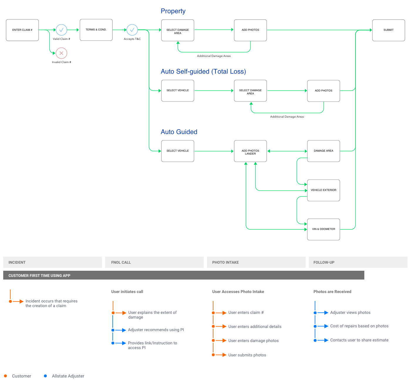
I came on to the product team as the sole designer after an initial product had already been created. I was tasked with creating a new self-guided experience at first for auto, also with a new design, that would take the user step-by-step around the vehicle, taking the photos necessary to create an initial estimate. This saved the company time and money having to send out a claim adjuster to verify the damage.
Measuring Success
Since we had a pretty clear idea of what we were tasked with building, I had to think about what improvements, if any, needed to be made to the user flow and how we'd do that without deviating too much from the timeline. From reviewing the native app, measuring analytics data and talking with stakeholders and users I came up with a few areas to consider:
- Photo Quality - Poor quality or the wrong photos resulted in inaccurate estimates and rework that costs the company money and users time and frustration.
- Steps to Complete - Reduce drop-off and time to complete by eliminating screens, taps and unnecessary form fields.
- Clarity of Message - Reduce the amount of textual content, consistent placement of elements, and visuals to streamline the process to again reduce drop off rate and time to complete.

Above are some of the final results, using Allstate brand guidelines. I was able to remove 10 screens from the original guided flow. One of the better improvements was deep linking the user into the process with a link provided in the Allstate native app or in an email/text which eliminated several steps; entering vehicle information and the claim number. The developers were also able to increase the quality of saved photos making it downstream to the claims adjusters to help increase estimate accuracy. I also reduced element clutter and gave screens elements consistent placement, especially the buttons taking you to next steps, putting them in easy to reach areas for your thumbs.
Photo Intake has several different flows depending on the type of damage (auto or property) and whether the process is guided, in which the user is asked to verify specific photos, or unguided, where they can upload photos of their choosing. I designed the app for each of these flows and for several other brands under the Allstate umbrella.
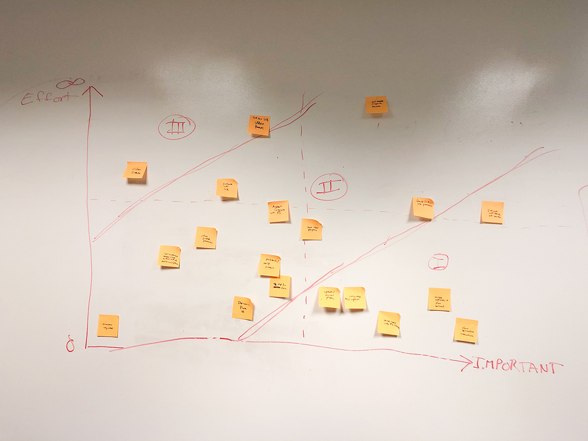
Along with making updates based on business needs we also collected feedback from users and the engineering team and prioritized it with the PM to find the best features and updates to make.
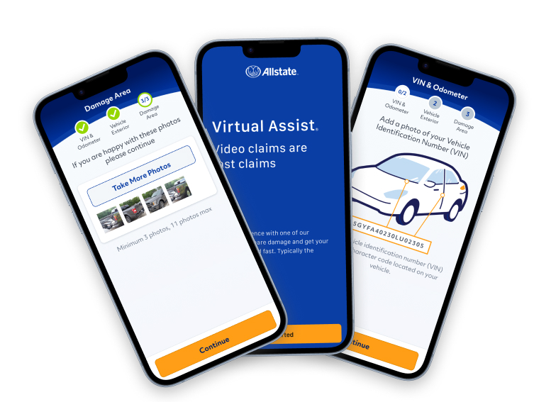
Virtual Assist
After the successful launch of Photo Intake I was also given another product, Virtual Assist, an app that allows users to video chat and share damage in order to get more difficult claims processed quickly.
Team
- 2 Product Owners
- Product Manager
- 4 Engineers
My Role
- User Research
- Interface Design
- Usability Testing
- Dev Handoff
Duration
- 5 months
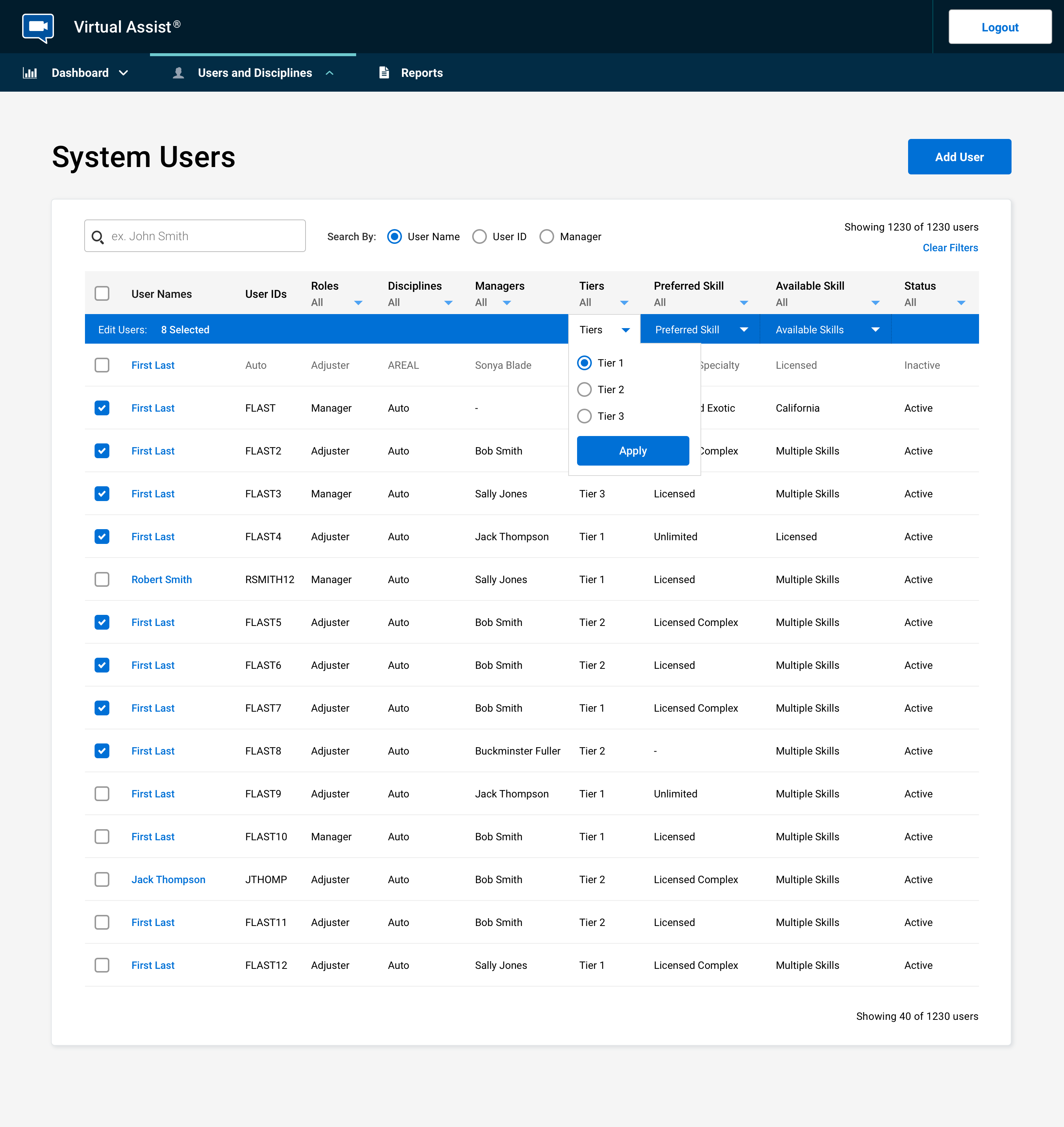
Virtual Assist was a more mature product. I started with a design pair and then took on the app by myself, primarily focusing on making improvements to the admin application that is used to route calls and manage internal users.
One of the big issues with this product was how calls were routed to internal and external claim adjusters and the tedium of making updates to dozens of adjusters' skills, one at a time, on a fairly regular basis. Work had to be done to create tiers of users, so video calls could be cascaded down from the front-line adjusters to the external adjusters when overflow occurs, as well as building two levels of skills to route property and auto calls to the right users. We also created the ability to add multiples of these skills to make the system even more flexible and cover as many use cases as possible.
This drastically improved our internal users ability to manage the system, and reduced the reliance on 3rd party call centers during peak activity, saving the company money.
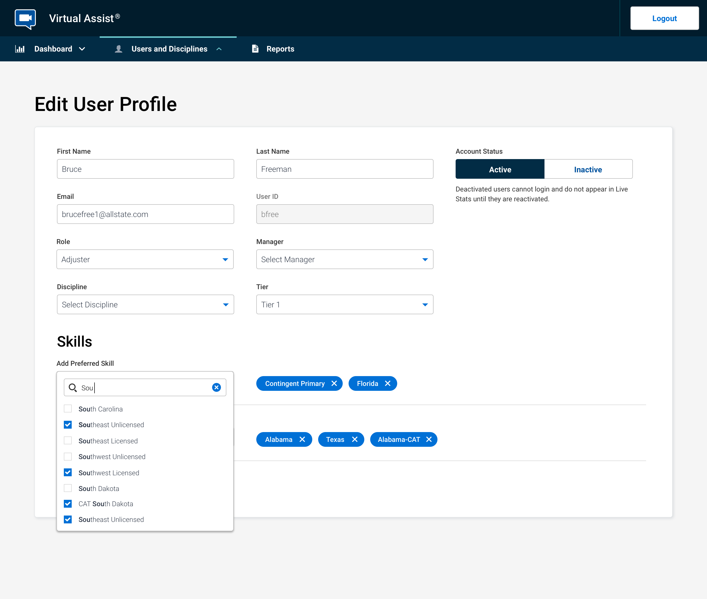
Another update to the admin app was adding the ability to multi-select and make batch changes to users. This helped the administrators shuffle resources around quickly and manage who would receive calls based on their tier, as well as primary and secondary skills.
Along with improving the routing of calls we were also looking to make improvements elsewhere in the experience. Below is a simple prototype I put together as an experiment, to see if the performance of the web app would be on par with the native app. I moved onto another product before getting the results but the idea was to remove the need for the customer to have to visit the app store and download the application to initialize the video call. An unnecessary step, especially for users who will only use the application a single time.

Collective
My third product is called Collective, a platform to allow gig workers to write damage reports in order to complete claims at a much lower cost.
Team
- Senior Business Stakeholders
- Product Owner
- Product Manager
- 6 Engineers
My Role
- User Research
- Interface Design
- Usability Testing
- Dev Handoff
Duration
- 4 months
Collective was a new product that started as a concept in the Chicago location and I took over when it came to our lab to be built. It started very much as a minimal viable product, just doing what we could to get it out into the world. So for this product the primary goal was to validate assumptions about its use and adoption. Besides just making sure the app works, making sure that the quality of work completed on the site meets or exceededs expectations. We measured against current employees to validate.
To make smart decisions about the features we implemented, I made sure we have the proper tracking setup to collect important metrics, so we had the quantitative data to understand user behavior. I conducted interviews with many of the initial users to see what issues they were having and how we could get new users up-to-speed on the platform faster.
One of the biggest challenges was making sure we got the right people on the platform. It was a hard requirement that the quality of the claims accessed need to be as good or better than those done by Allstate employees. To help with this we created an onboarding assessment that users needed to pass, that would gauge their abilities and knowledge before being allowed to work on the platform. We were also working on a quality score metric to share out to the gig workers and remove those who were not performing.
One of the improvements I implemented early on, was to reduce the number of steps to complete the assessment, getting more gig workers on the application faster, without reducing the quality of applicants making it onto the platform.
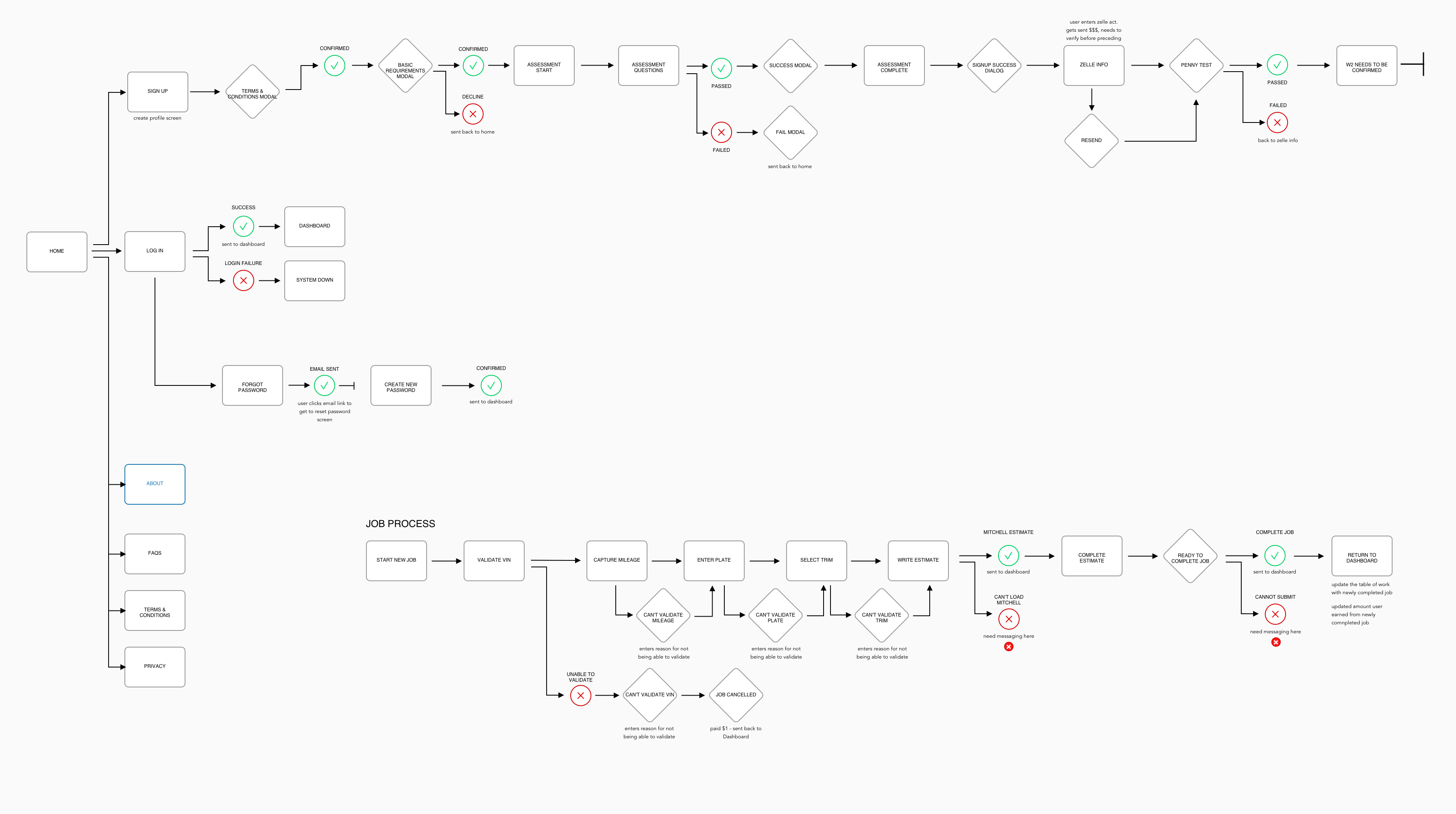
Besides the assessment there were many friction points in the onboarding process. Below is the onboarding flow with proposed updates to reduce the onboarding time drastically.
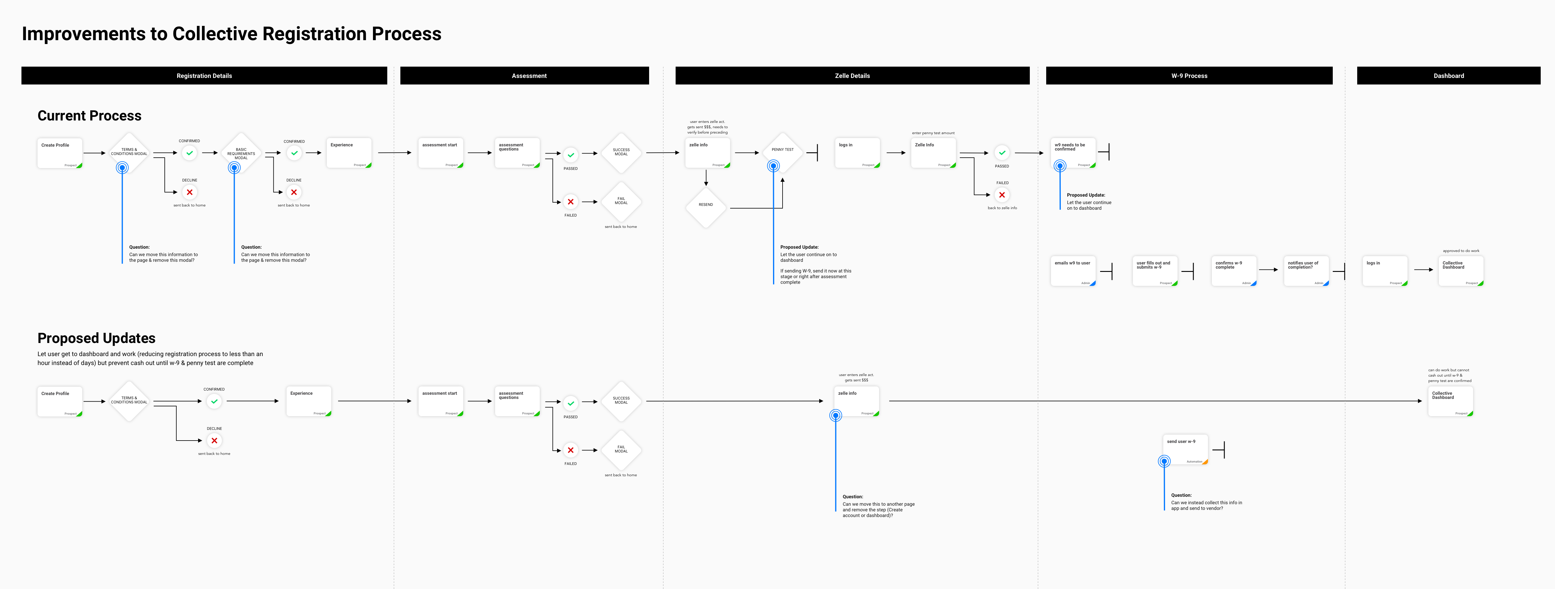
There were a few big issues with onboarding:
- Penny Test In order to do work a user needed to submit bank information. A small amount of money was sent to their account and they needed to verify the amount, all before being able to do work. Since, this was only important for doing withdrawals after completing work, I proposed letting the user complete work and prompt them for the information before they are able to withdraw their earnings, if they haven’t already completed the test.
- W-9 We were also gating the process behind a W-9 form requirement that was sent via email. I proposed updating the process so the user could fill out and sign the form from the application, so they can start working immediately.
- Modals There were also two terms and conditions like modal, that I proposed where moved to the signup page so that it could be consolidated down to a single screen, for quicker onboarding.
The job process interface used the same clean and simple styles as the onboarding process, which added consistency to the experience and cut down on development time.
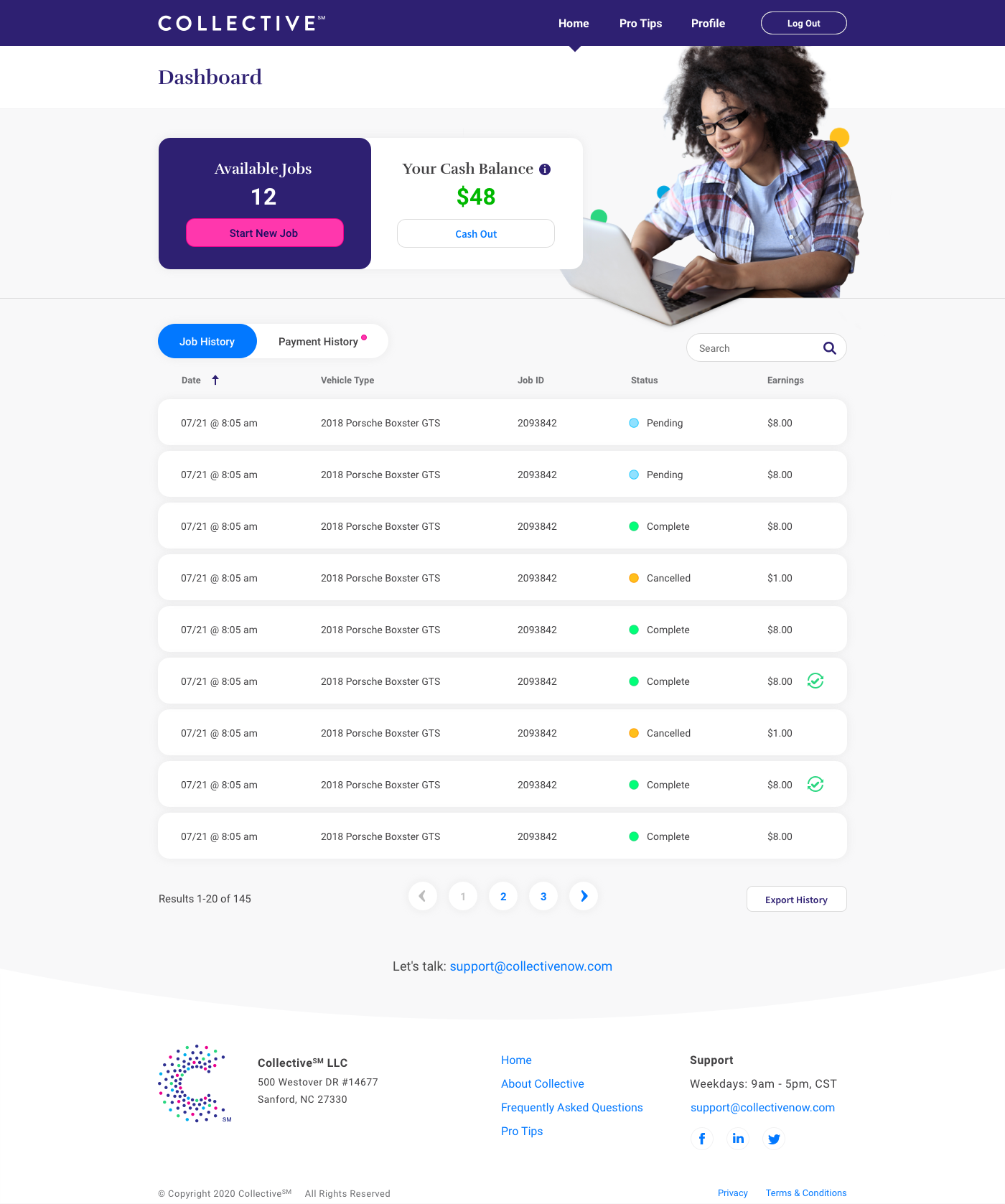
New and existing users were taken to the dashboard after logging in. The dashboard is where users can start new jobs and see their job and payment history.
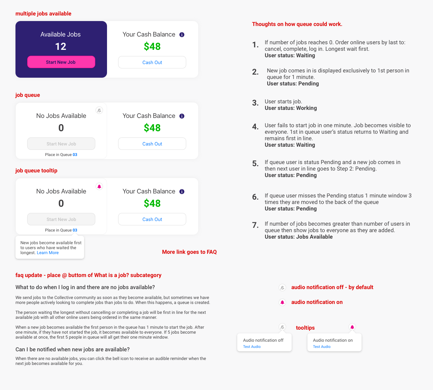
One of the issues you don't always think about with a feature or app design is success. In this case, after launch we had more workers than work, so needed to quickly come up with a solution for what happens when the job queue hits 0. This is my design file right out of Sketch.
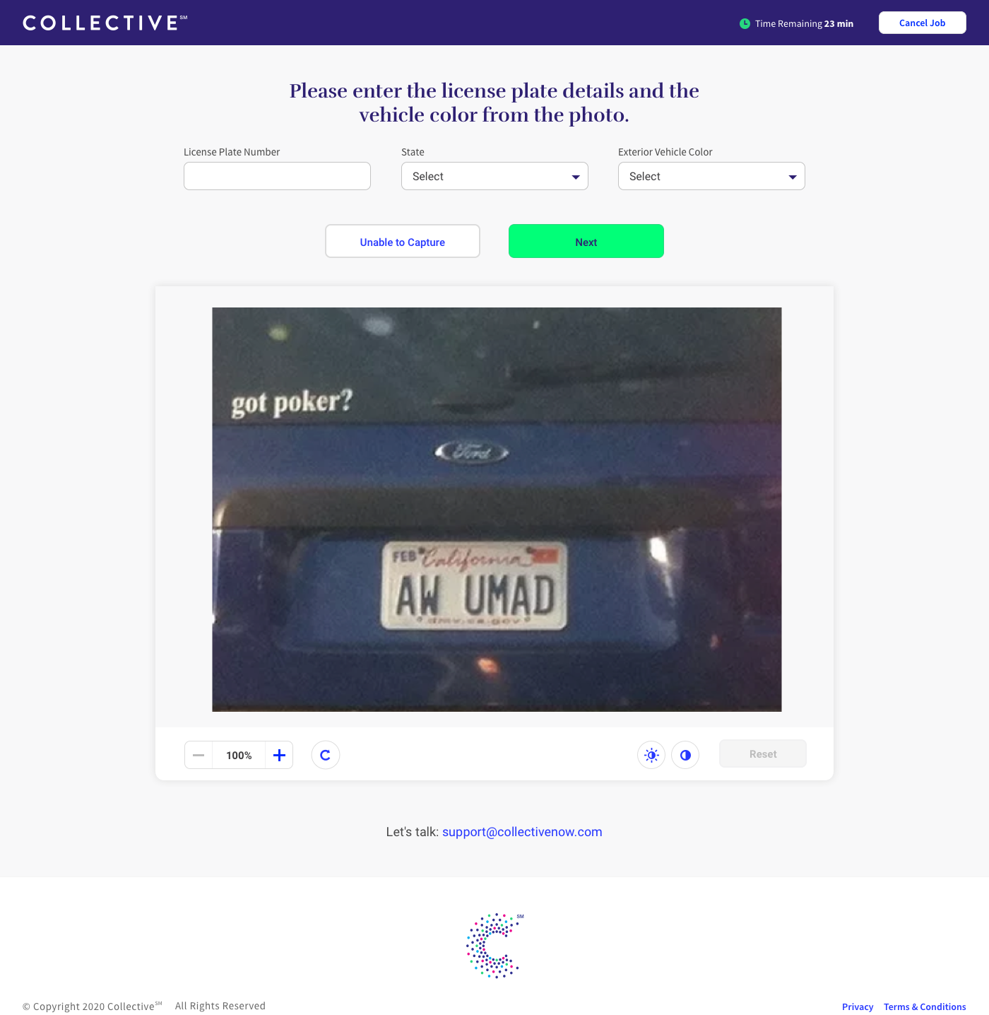
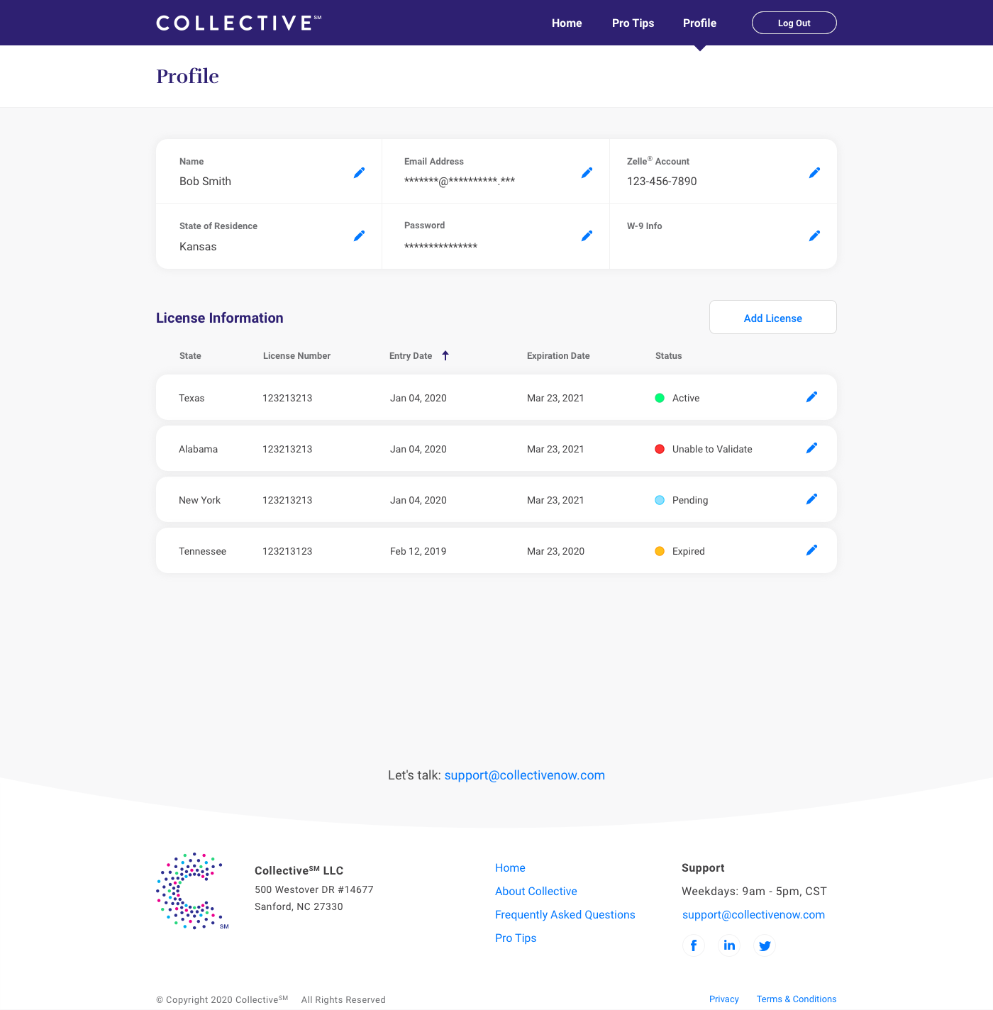
The profile was one of the last additions to Collective. One of the issues we ran into was different states had different licensing requirements, so we created a way for users to upload their license information, that we could then verify on the backend. This prevented having to manually verify and assign different gig workers to each state they were eligible to work in.
Here is the overall process flows and screens for registration and the completion of work process on Collective. I originally created this to help onboard a new team member along with an Invision prototype of the application for user testing.