While at Farecompare as the sole product designer, I spent time on a variety of new design projects as well as redesigning all the existing applications.
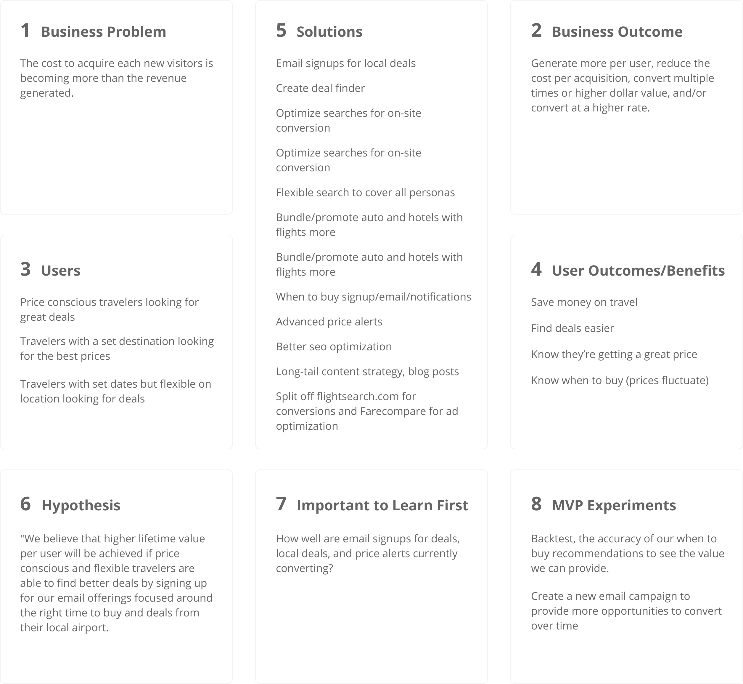
Design Challenge
One of the challenges of working on these projects was the competing ways the company made revue. As the name implies, you are able to compare flights, hotels or auto rentals across companies but also across other websites. We could make money by the user booking from our site, or from sending the user off to a competitor. So there was a constant tradeoff between streamlining the onsite booking process and promoting third party ads.

The space was crowded but quickly consolidating, and the value of comparison shopping was losing steam because the amount of variance between prices at different sites was diminishing. Google was also cornering the market with their search platform, and apps like Hopper were finding ways to get customers cheaper flights, which should always be the goal.
Besides trying to make a compelling design, the goal was to try and add value for users while promoting some of the revenue adding features. For example on the homepage, we lead with a promo section for local flight deals and an email signup. We followed that with a guide to show some of our domain expertise in finding the cheapest flights. The Getaway map was another product I helped redesign for users who didn't know where to go but might want to see prices to travel to different destinations around the world.

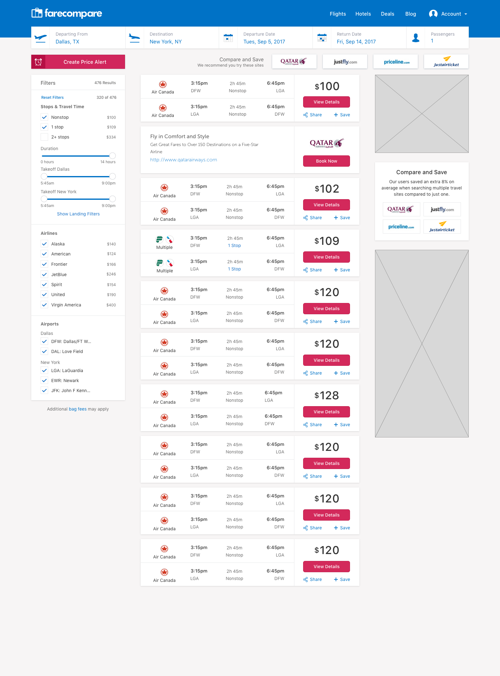
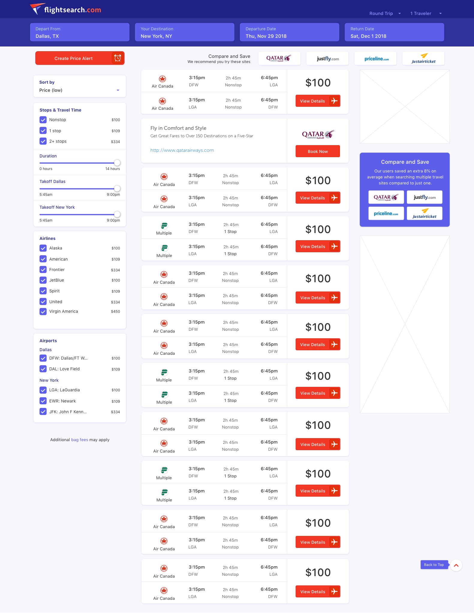
For the main flight search, I went with a clean layout which highlights the flight display but also provides space for ad placement.
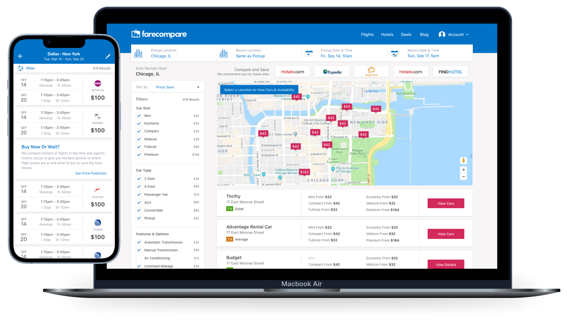
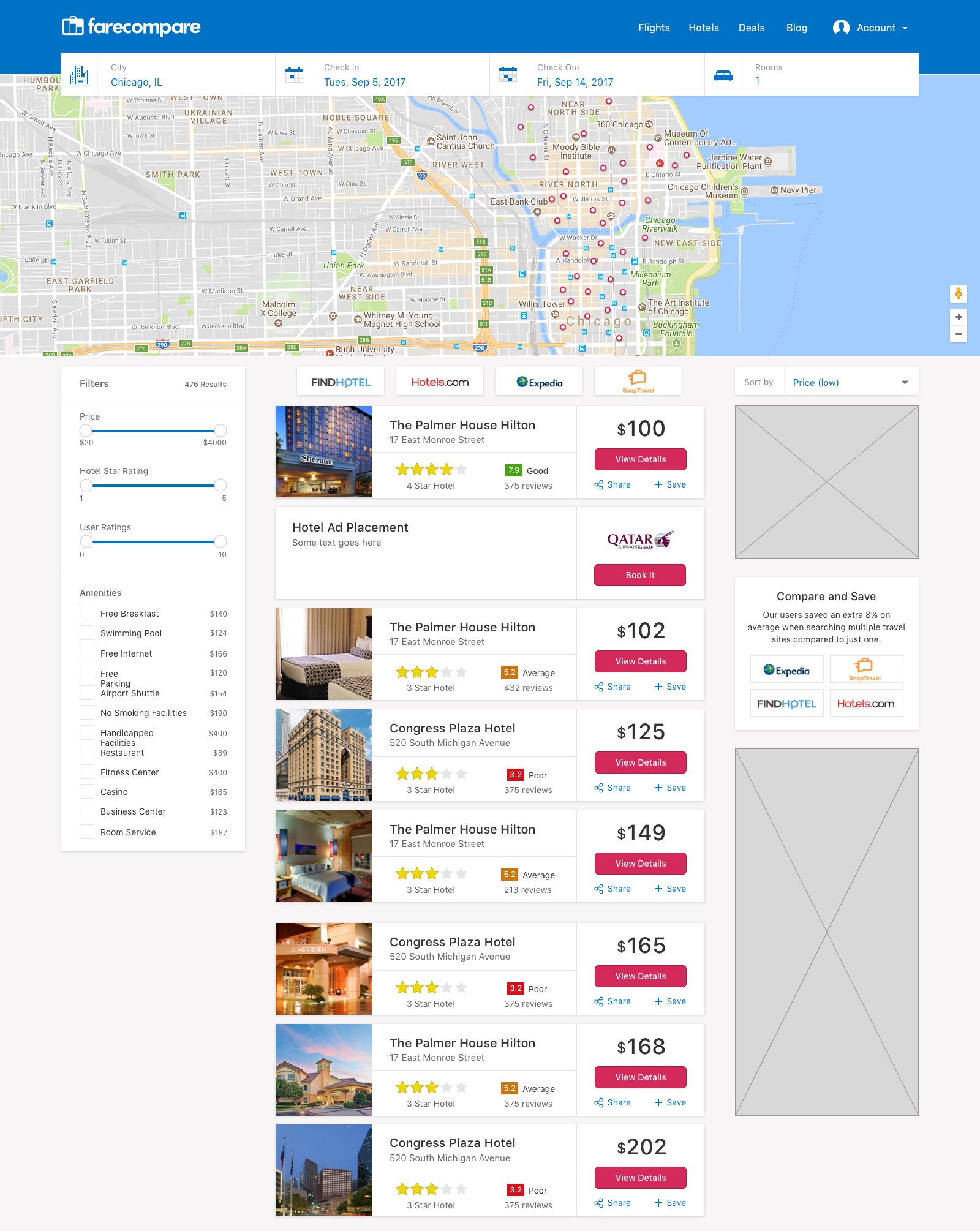
Hotel results used a similar layout to flights but incorporated a map because location is often key for travellers.
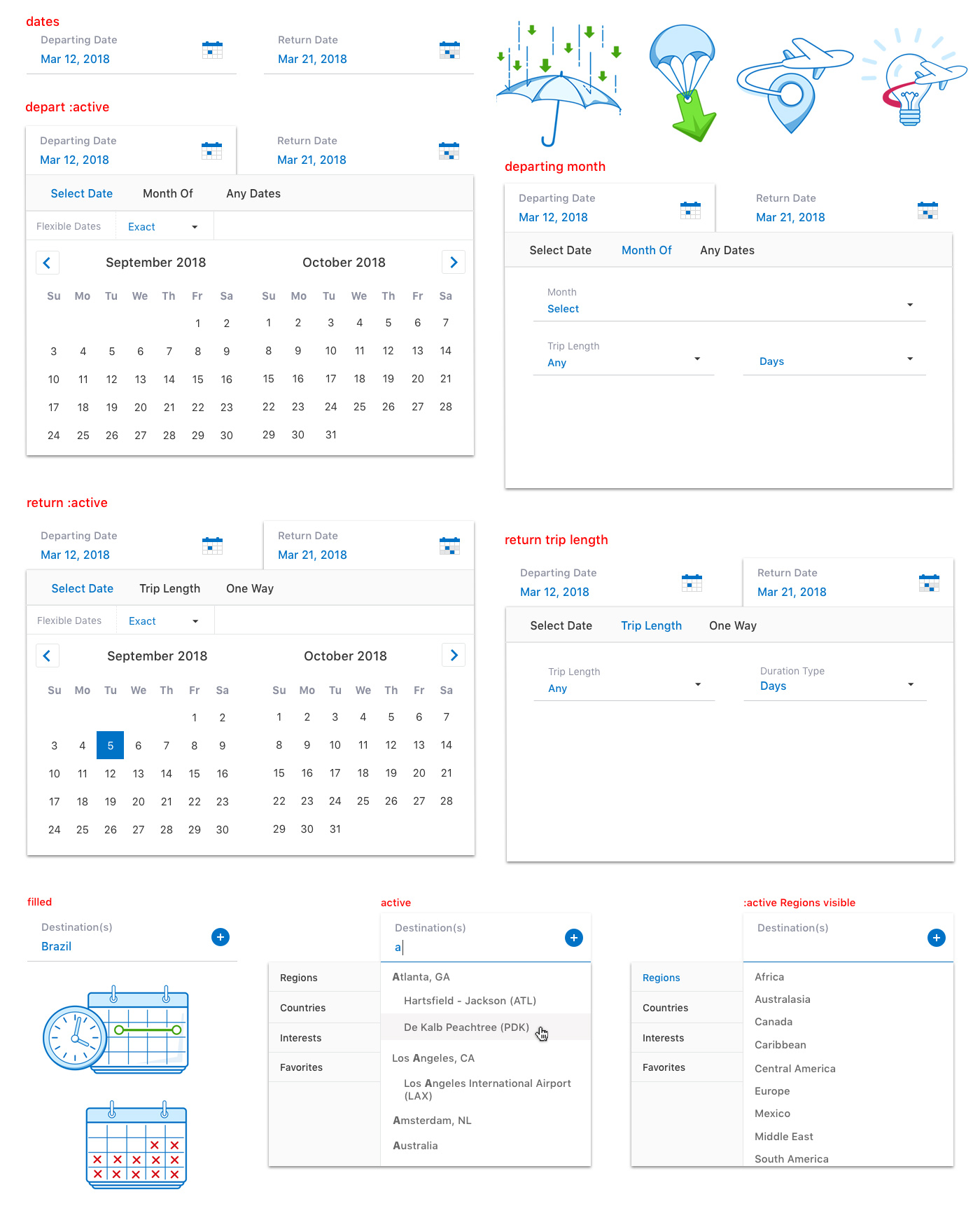
There are various personas we wanted to address:
- Set Destination and Date - Most travellers know where they need to go and when, they simply want the best price, convenience and amenities
- Set Date - Some user knew when they had vacation but might have not had a specific destination in mind or were looking for something within a certain budget
- Deals - Some users were flexible with their travel and wanted to get the most bang for their buck.
We created new advanced search tools to address different user's needs. Also, some little illustations I created.
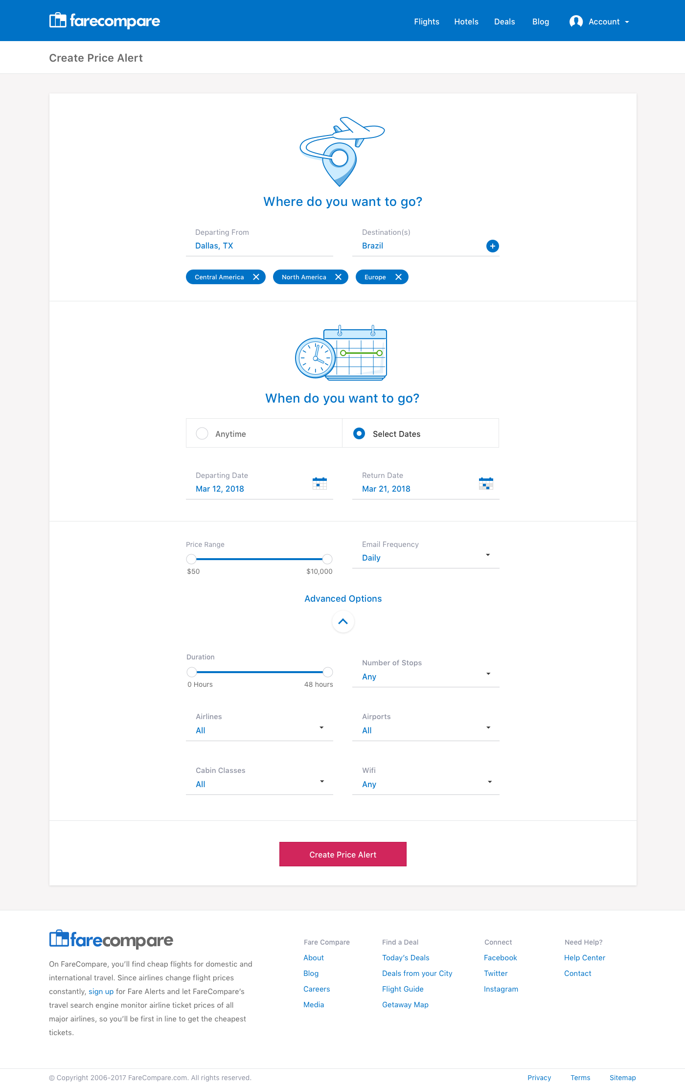
Another project was advanced options for price alerts. Instead of just the standard change in price email we'll be allowing users to select specific airlines, stops, price ranges, and lots of other features.
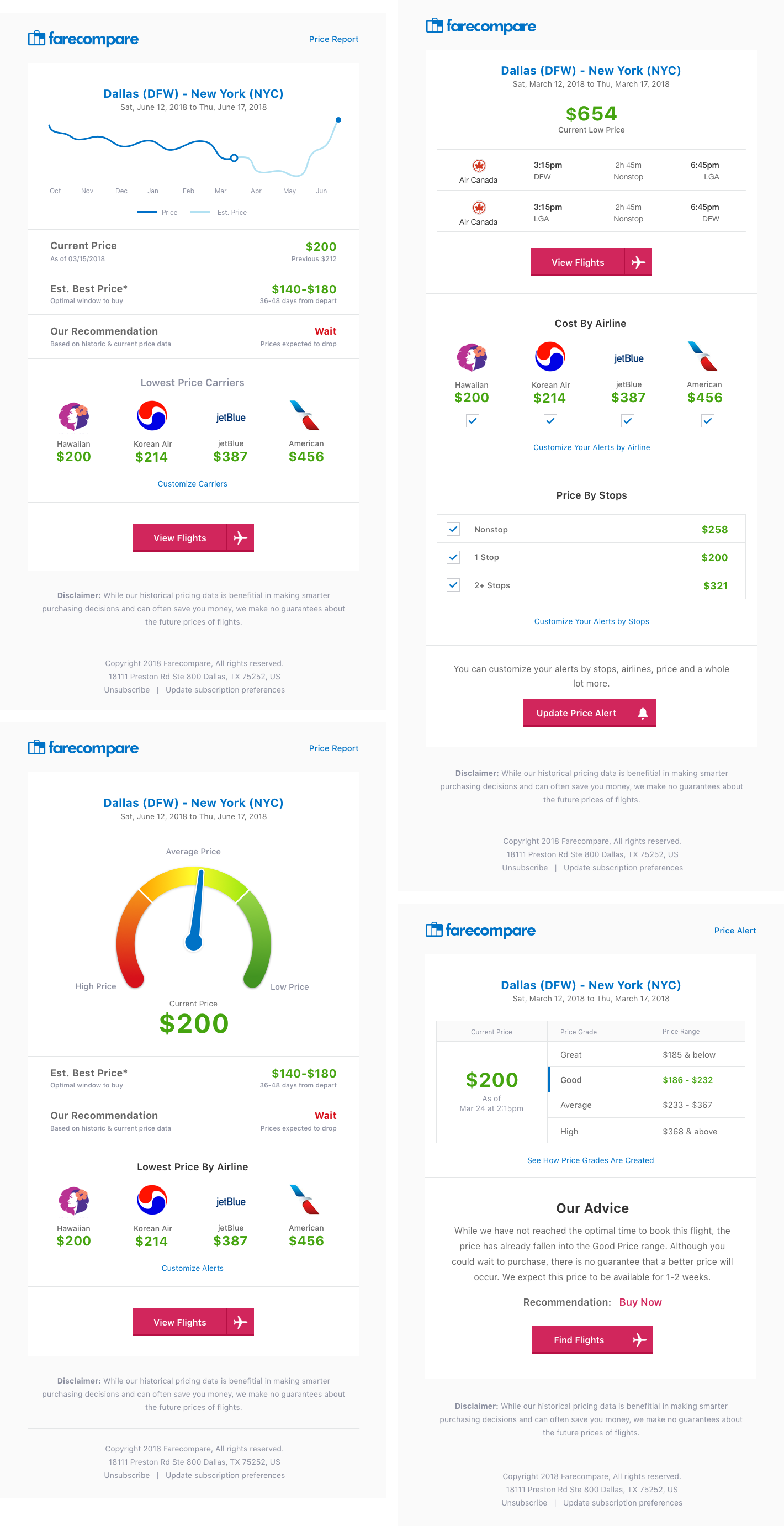
Email template concepts for price alerts, giving users even better data not only about current prices but using historic data to predict price changes.
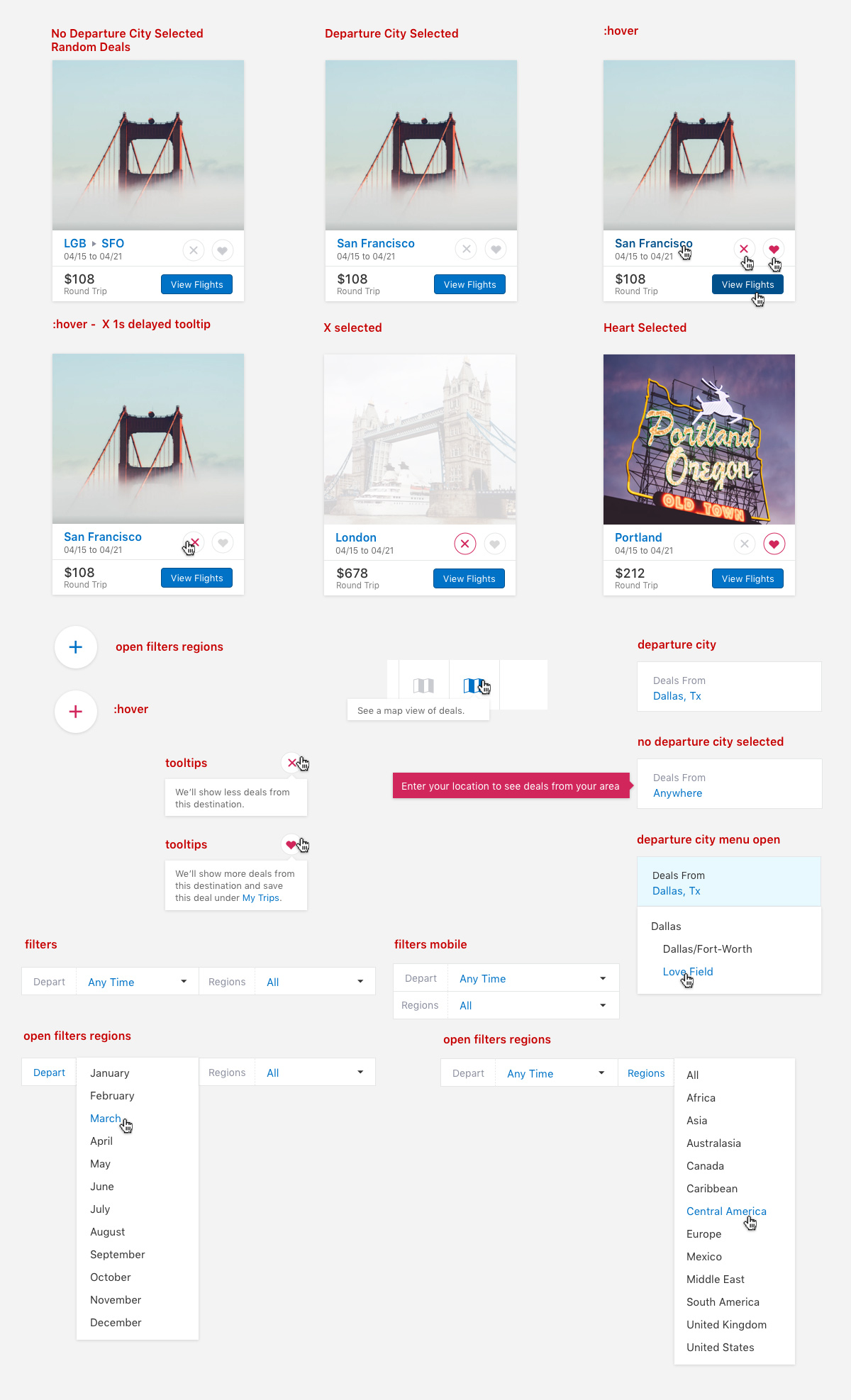
And yet another project is a deals app, which will display deals from the selected departing city or airport. This was created for users who are price sensitive but not specific on when or where they wanted to go.

Some more styles showing the interactions for the deals. Users will be able to favorite certain destinations which will appear more frequently on the deals page and within email being sent.
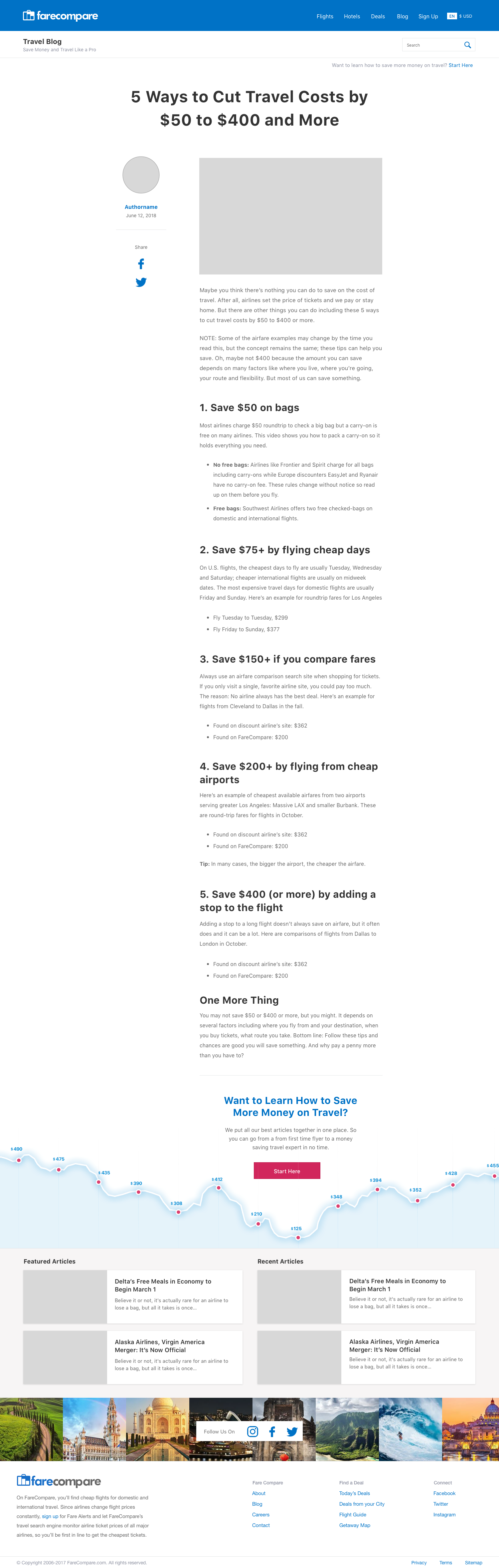
The blog already had several hundred posts, many of which were fairly short, so I went with a fairly narrow column for the body of the post. At the bottom of each post I included a link with the graph visual to give users additional content and to keep them on the site. The Start Here link went to a hub page I created with all the popular evergreen content on the blog. An easy place for users to get the best long-form content and again, stay longer on site.
An example of a category page template. Most of these pages I designed and then created the html and css for and handed them off to our WordPress guy to turn into templates.

The last project was to build a seperate site with updated but not completely different interface elements. Basically, a reskin. I created a quick mark and logo and the interface for the homepage and main search pages.

The interface remained similar so the same code base could be used, just with a design refresh to the colors and styles of the elements.
Conclusion
While ultimately, I was proud of my design work and believe I made some real improvements, the sun was setting on this business model. The main area we could have added value to the user was with helping knowing when prices would be at their lowest (like Hopper). Comparison had limited value at this point but prices did fluctuate from the time they were posted to when the flight took off. There is typically an optimal window to buy and I think that product is being worked on but hasn't seen widespread adoption yet. Maybe one of these days I'll get back in the travel space and try to solve it.